Changing Default Variables:
Open src->assests->scss->_bootstrap-override.scss file and change style variable values as per your requirement.
Change Theme Colors
You can change the theme colors using the given style variables.
//App Background Scale

$blue:             #5C6AC4 !default; //Manage Primary Color
$cyan:             #47C1BF !default; //Manage Info Color
$green:            #50B83C !default; //Manage Success Color
$yellow:           #F49342 !default; //Manage Warning Color
$red:              #DE3618 !default; //Manage Danger Color

$indigo:           #174176 !default;
$teal:             #007ACE !default; // Manage Secondary Color

$purple:           #6f42c1 !default;
$pink:             #FF2B72 !default;
$orange:           #EEC200 !default;
Change Text Colors
You can change the text colors using the given style variables._bootstrap-override.scss
 // App Text Scale

$white:                          #fff    !default;
$gray-100:                       #F4F6F8 !default;
$gray-200:                       #ECEDEF !default;
$gray-300:                       #DBDBDB !default;
$gray-400:                       #C6C9CF !default;
$gray-500:                       #919EAB !default;
$gray-600:                       #657786 !default;
$gray-700:                       #454F5B !default;
$gray-800:                       #393C40 !default;
$gray-900:                       #14171A !default;
$black:                          #000    !default;
Heading
With help of following variables you can easily change font sizes for all headings ( h1 to h6)._bootstrap-override.scss
// Setting For Heading Element

$h1-font-size:                    2.25rem  !default; //36px
$h2-font-size:                    1.875rem !default; //30px
$h3-font-size:                    1.5rem   !default; //24px
$h4-font-size:                    1.125rem !default; //18px
$h5-font-size:                    1rem     !default; //16px
$h6-font-size:                    0.875rem !default; //14px

$headings-margin-bottom:          ($spacer / 2) !default;
$headings-font-family:            inherit !default;
$headings-font-weight:            400 !default;
$headings-line-height:            1.2 !default;
$headings-color:                  inherit !default;
Main Container
To change app background color go to _bootstrap.override.scss file and change following values.
// Settings for the  <body>  element.
$body-bg:                         $gray-100 !default;
$body-color:                      $gray-700 !default;

// stylelint-disable value-keyword-case
$font-family-sans-serif:                         'Heebo', sans-serif !default;
$font-family-monospace:                          SFMono-Regular, Menlo, Monaco, Consolas, "Liberation Mono", "Courier New", monospace !default;
$font-family-base:                               $font-family-sans-serif !default;
Font Customizations
Adding a New Font Family
If you want to change the existing font of the template, you can easily change them. We are using Google Fonts in the template as it is free to use and is easily available. For more info, please visit:
Google Fonts
Making the web more beautiful, fast, and open through great typography
fonts.google.comStep 1: To change the font family in the template, please visit the above link and select the font you wish to apply to your template and copy the embed code & font family. Example:
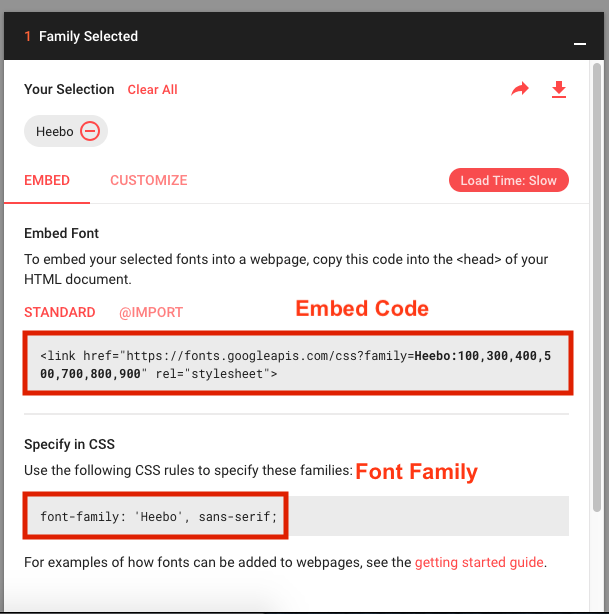
Paste the embed code in index.html file under the public folder.
Make sure to copy the embed code in the head tag of the index.html file.
Step 2: Now open the _bootstrap.override.scss file and paste the font family in the variable $font-family-base like:
$font-family-sans-serif: 'Heebo', sans-serif;
Customizing the existing font
This all you need to use a new font in the template.
If you want to make the customizations in the existing font then you can change the variables defined below:
Change the font family and font size in _app.variables.scss file._bootstrap.override.scss
 // stylelint-enable value-keyword-case_app.variables.scss

$font-size-base:                  1rem !default; // Assumes the browser default, typically `16px`
$font-size-lg:                    ($font-size-base * 1.25) !default;
$font-size-sm:                    ($font-size-base * .875) !default;

$font-weight-light:               300 !default;
$font-weight-normal:              400 !default;
$font-weight-bold:                700 !default;

$font-weight-base:                $font-weight-normal !default;
$line-height-base:                1.5 !default;
All the above customizations like Theme color, Text color & Heading are done in the same file i.e. _bootstrap-override.scss
For other customizations like Gradient color, side bar, content block, header styling, main container & fonts can be done in_app-variables.scss file under the same directory i.e. src->assets->scss.
Gradient Colors
If you want to use gradient colors then use these variables with basic values.
// Gradient Theme Color

$sidebar-dark-gradient:            linear-gradient(0deg, #464D69 0%, rgba(70, 77, 105, 1) 100%);
$sidebar-dark:                     #2E3344;
$overlay-light:                    rgb(255,255,255);
$gradient-primary:                 linear-gradient(180deg, #5D92F4 0%, #09203F 100%); // Primary
$gradient-purple:                  linear-gradient(0deg, #F53844 0%, #42378F 100%); // Purple
$gradient-success:                 linear-gradient(180deg, #00D0BD 0%, #007ADF 100%); // Success
$gradient-warning:                 linear-gradient(0deg, #B02E0C 0%, #FFB70F 100%); // warning
$gradient-danger:                  linear-gradient(0deg, #B02E0C 0%, #FFB70F 100%);// danger
Sidebar Customization
You can change all properties of the sidebar from the given variables.
// Sidebar Variable

$sidebar-width:                   16.25rem; //280px;
$sidebar-box-shadow:              none;

$sidebar-link-fontsize:           1rem; //14px
$sidebar-link-font-weight:        400;
$sidebar-link-font-color:         $gray-900;
$sidebar-link-transform:          capitalize;
$sidebar-link-spacing:            0.9375rem 2rem; //15px 40px;

$sidebar-icon-font-size:          1rem; //14px;

$sidebar-hover-bg:                rgba(0,0,0,0.22);
$sidebar-hover-color:             $white;

$sidebar-submenu-font-size:       1rem; //14px
$sidebar-submenu-font-color:      $gray-900;
$sidebar-submenu-spacing:         0.9375rem 2.5rem 0.9375rem 4.375rem;

// Mini Sidebar Variable

$mini-sidebar-width:              85px;
Content Block
Customise your main block settings with help of the following variables.
// Block Settings

$block-bg:                       $white;
$block-border-radius:            5px;
$block-border:                   none;
$block-spacing:                  1.25rem 1.25rem; //20px 20px;
$block-shadow:                   0 1px 15px 1px rgba(69,65,78,0.08);
$block-hover-shadow:             0 1px 15px 1px rgba(69,65,78,0.08);
$block-margin-bottom:            $grid-gutter-width; //24px
$block-transition:               all 0.4s ease-in-out 0s;

$block-title-color:              $gray-900;
$block-title-spacing:            0.9375rem 1.25rem; //15px 20px;
$block-title-font-size:          1rem; //16px
$block-title-font-weight:        500;
$block-title-transform:          capitalize;

$block-contextual-color:         $gray-600;
$block-contextual-font-size:     1rem;

$block-footer-border-width:      1px;
$block-footer-border-color:      $gray-300;
Header Styling
Customise your header styling with help of the following variables.
// Navbar Varibale

$navbar-height:                   4rem; //80px;
$navbar-bg:                       $white;
$hamburger-icon-color:            $gray-600;
$navbar-icon-height:              35px;
$navbar-icon-width:               35px;
$navbar-link-color:               $white;
Footer Styling
Customise your footer styling with help of the following variables.
// Footer Variable

$footer-height:                   50px;
$footer-bg:                       $navbar-bg;
$footer-box-shadow:               none;
Changing Color Values For Charts And Map
You can change the color of charts and maps from the src->constants->chart-config.js file.
/**
 Change all chart colors
 */
 import AppConfig from './AppConfig';
 const { primary, info, danger, success, warning, purple, secondary, yellow, white, greyLighten, grey } = AppConfig.themeColors;
 const ChartConfig = {
   color: {
     'primary': primary,
     'info': info,
     'warning': warning,
     'danger': danger,
     'success': success,
     'default': '#DEE4E8',
     'purple': purple,
     'secondary': secondary,
     'yellow': yellow,
     'white': '#FFFFFF',
     'dark': white,
     'greyLighten': greyLighten,
     'grey': grey
   },
   legendFontColor: '#AAAEB3', // only works on react chart js 2
   chartGridColor: '#EAEAEA',
   axesColor: '#657786',
   shadowColor: 'rgba(0,0,0,0.6)'
 }
 // Tooltip Styles
 export const tooltipStyle = {
   backgroundColor: 'rgba(0,0,0,0.6)',
   border: '1px solid rgba(0,0,0,0.6)',
   borderRadius: '5px'
 }
 export const tooltipTextStyle = {
   color: '#FFF',
   fontSize: '12px',
   paddingTop: '5px',
   paddingBottom: '5px',
   lineHeight: '1'
 }
 export default ChartConfig;
