Changing the Default Theme
We have already covered this topic in the Themes section in the side menu. Please visit that section to get detail information about changing the default theme’s.
Theme Customization
When you open the src -> themes folder, you will see, different theme files there. Choose from them the file in which you want to make the desired changes. When you open one of the theme file you will find different color values defined like below:
export default {
   primary: '#5D92F4',
   secondary: '#424242',
   accent: '#82B1FF',
   error: '#FF3739',
   info: '#00D0BD',
   success: '#00D014',
   warning: '#FFB70F'
}
You can make the changes in the color code given above as per your requirements. After all the changes, save the file and open the browser, you will see the new colors in the template.
For more info, check out the following link.
You can find all the style variables(that are used in the given examples) inside the
src -> assets -> scss -> _app.variables.scssfile.
Changing the Font Family
We are using Google Fonts in the template as it is free to use and is easily available. For more info, please visit:
Google Fonts
Making the web more beautiful, fast, and open through great typography
fonts.google.comStep 1: To change the font family in the template, please visit the above link and select the font you wish to apply to your template and copy the embed code & font family. Example:
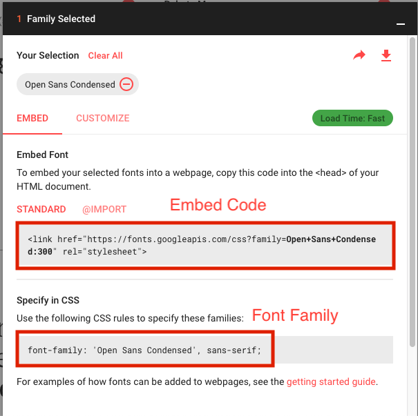
Paste the embed code in index.html file under the public folder.
Make sure to copy the embed code in the head tag of the index.html file.
Step 2: Now go to the src->assets->scss and open the _app.variables.scss file and paste the font family in the variable $font-family-base like:
$font-family-base: 'Open Sans Condensed', sans-serif;
Sidebar Customization
You can easily change the width, background color, text color etc of the sidebar easily. Open the src->components->Header->Header.vue file. For modifications in the width. change the value of the width parameter in the given code:
<v-navigation-drawer
     ...
     :width="250"
     ...
>
You can change all other properties of the sidebar from the given variables. You can find these variables inside this src->assets->scss->_app.variables.scss file:
// Sidebar Variable
$sidebar-bg:                   #2E3344;
$sidebar-width:                250px;
$sidebar-nav-color:            #1D2433;
$sidebar-nav-text-size:        14px;
$sidebar-nav-active-color:     $light;
$sidebar-nav-font-weight:      500;
$sidebar-box-shadow:           0 0 10px 0 rgba(0,0,0,0.5);
$sidebar-subnav-font-size:     $sidebar-nav-text-size;
$sidebar-subnav-font-color:    $sidebar-nav-color;
Change Text Colors
You can change the text colors using the given style variables.
// App Text Scale

$gray-dark:                 #273142 !default;
$gray:                      #354052 !default;
$gray-light:                #9799A8 !default;
$gray-lighter:              #DDE6F3 !default;
Gradient Colors
If you want to use gradient colors then use these variables with basic values.
// Gradient Theme Color

$light-primary:         linear-gradient(0deg, #6A11CB 0%, #2575FC 100%); // Primary
$light-success:         linear-gradient(180deg, #00ECBC 0%, #007ADF 100%); // success
$light-pink:            linear-gradient(0deg, #002849 0%, rgba(231,2,94,1) 100%); // Pink
$light-warning:         linear-gradient(180deg, #FF9944 0%, #FC6076 100%); // warning
$light-purple:          linear-gradient(180deg, #3023AE 0%, #C86DD7 100%);// purple
Content Block
Customise your main block settings with help of the following variables.
// App Custom Card

$card-bg:                         #FDFDFD;
$card-border-radius:              5px;
$card-border:                     1px solid #DDE6F3;
$card-spacing:                    1.25rem 1.25rem;//20px 20px
$card-margin-bottom:              1.25rem; //20px
$card-shadow:                     0 8px 13px 0 rgba(0,0,0,0.12);
$card-hover-shadow:               none;

// Card Title

$card-title-color:                #354052;
$card-title-font-size:            1.375rem; //22px
$card-title-transform:            capitalize;
$card-title-weight:               600;
$card-title-spacing:              1.25rem 1.25rem;//20px 20px

// Card Contextual link

$contextual-link-size:            1.25rem;//20px
$contextual-link-color:           #D8D8D8;
Change Header Styling
You can also modify the header using the variable defined below:
// App Header Varibale

$navbar-bg:                     $purple;
Main Container
To change app background color, go to _app.variables.scss file and change the following values.
// Settings for the  <body>  element.

$body-bg:                       $light;
$body-color:                    $gray;
$font-family-base:              'Source Sans Pro', sans-serif;
$border-color:                  darken($navbar-bg, 5%);
Heading
With help of following variables you can easily change font sizes for all the headings ( h1 to h6 ).
// Setting For Heading Element

 $h1-font-size:                1.75rem !default;      // 28px
 $h2-font-size:                1.5rem !default;       // 24px
 $h3-font-size:                1.375rem !default;     // 22px
 $h4-font-size:                1.125rem !default;     // 20px
 $h5-font-size:                1rem !default;         // 16px
 $h6-font-size:                0.875rem !default;     // 14px
Dark Theme Variable
Change the dark theme variables as per your requirement.
// Dark theme

 $dark-bg:                      #424242;
 $dark-bg-color:                #fff;
 $dark-bg-container:            #303030;
 $dark-border-color:            rgba(0, 0, 0, 0.1);
