Changing Default Variables:
Open src->assets->scss->_variables.scss file and change style variable values as per your requirement.
// Custom Variable

// Common color
$white:#ffffff;
$bg-default:#f3f7fa;
$gray-shade-1:#f4f5f9;
$gray-shade-2:#f5f5f5;
$gray-shade-3:#f3f3f3;

//Primary theme
$primary:#4d7df2;
$secondary: #ff8600;
$success: #00d41a;
$info: #00d0bd;
$error: #e53935;
$warning: #ffb70f;

// Text color
$text-color: #29303b;
$text-sec-color:#717275;
$dark: #29303b;
$color-disabled:#969fa4;

// Border color
$border-color: #e0e0e0;

// Rating color
$rating-color:#f9bf00;

//Shop List Img Bg Color
$img-holder-color:#edf1f2;
$facebook: #3c5a9a;
$google: #db4437;
$twitter: #1da1f2;
$github: #000000;

// Box Shadow
$box-shadow:0 1px 3px 0 rgba(0, 0, 0, 0.1), 0 1px 2px 0 rgba(0, 0, 0, 0.06);
Changing Teal theme variable color:
Open src->assets->scss->_teal-theme.scss file and change style variable values as per your requirement.
// Teal Theme
$primary:#028484;
$secondary: #d99830;
$success: #37ae3d;
$info: #00d0bd;
$error: #e64c3d ;
$warning: #ffb70f;
Changing Violet theme variable color:
Open src->assets->scss->_violet-theme.scss file and change style variable values as per your requirement.
// Violet theme
$primary: #53419a;
$secondary: #f0bc02;
$success: #37ae3d;
$info: #00d0bd;
$error: #e53935 ;
$warning: #ffb70f;
Changing Dark theme variable color:
Open src->assets->scss->_dark-theme.scss file and change style variable values as per your requirement.
// Dark Theme
$bgPaper:#27293c;
$bgDefault: #1e1e2e;
$textPrimary: #9d9daf;
$textSecondary: #717275;
$borderColor:$textPrimary;
$success: #37ae3d;
$info: #00d0bd;
$error: #e64c3d ;
$warning: #ffb70f;
Changing Color Values For Charts And Material-ui Theme
Go to src->constants->appConfig.js file
/**
 * App Config File
*/
const AppConfig = {
  ...
   // Default Theme Colors
   lightThemeColors: {
      'primary': '#4d7df2',
      'secondary': '#ff8600',
      'success': '#00d41a',
      'info': '#00d0bd',
      'warning': '#ffb70f',
      'error': '#e53935',
      'textPrimary': '#29303b',
      'textSecondary': '#717275',
      'divider': '#e0e0e0',
      'icon': '#717275',
      'bgPaper': '#FFFFFF',
      'bgDefault': '#f3f7fa',
      'white':'#ffffff',
      'black':'#000000'
   },
   // Teal Theme Colors
   tealThemeColors: {
      'primary': '#028484',
      'secondary': '#d99830',
      'success': '#00d41a',
      'info': '#00d0bd',
      'warning': '#ffb70f',
      'error': '#e64c3d ',
      'textPrimary': '#29303b',
      'textSecondary': '#717275',
      'divider': '#e0e0e0',
      'icon': '#717275',
      'bgPaper': '#FFFFFF',
      'bgDefault': '#f3f7fa',
      'white':'#ffffff',
      'black':'#000000'
   },
   // Violet Theme Colors
   violetThemeColors: {
      'primary': '#53419A',
      'secondary': '#F0bc02',
      'success': '#ff8600',
      'info': '#00d0bd',
      'warning': '#ffb70f',
      'error': '#e53935',
      'textPrimary': '#29303b',
      'textSecondary': '#717275',
      'divider': '#e0e0e0',
      'icon': '#717275',
      'bgPaper': '#FFFFFF',
      'bgDefault': '#f3f7fa',
      'white':'#ffffff',
      'black':'#000000'
   },
   // Dark Theme Colors
   darkThemeColors: {
      'primary': '#4d7df2',
      'secondary': '#ff8600',
      'success': '#00d41a',
      'info': '#00d0bd',
      'warning': '#ffb70f',
      'error': '#e53935',
      'textPrimary': '#9d9daf',
      'textSecondary': '#717275',
      'divider': 'rgba(255,255,255,0.12)',
      'icon': '#717275',
      'bgPaper': '#27293c',
      'bgDefault': '#1e1e2e',
      'white':'#ffffff',
      'black':'#000000'
   }
}
Font Customizations
Adding a New Font Family
If you want to change the existing font of the template, you can easily change them. We are using Google Fonts in the template as it is free to use and is easily available. For more info, please visit:
Google Fonts
Making the web more beautiful, fast, and open through great typography
fonts.google.comStep 1: To change the font family in the template, please visit the above link and select the font you wish to apply to your template and copy the embed code & font family. Example:
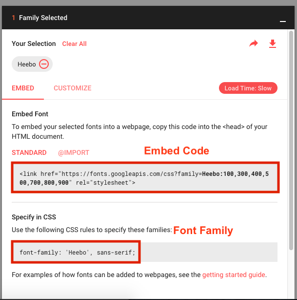
Paste the embed code in index.html file under the public folder.
Make sure to copy the embed code in the head tag of the index.html file.
Step 2: Now open the src->themes->LightTheme->index.js file and paste the font family in typography like:
const theme = createMuiTheme({
   ...
   typography: {
      ...
      fontFamily: "'Roboto', sans-serif", // update new font family here
      ...
   },
   ...
});
Change Typography :
If you want to change the default typography of the template , you can easily change them. Go to src->themes->LightTheme->index.js file and do changes as per your requirement.
const theme = createMuiTheme({
    …
    typography: {
       htmlFontSize: 16,
       ...
       fontSize: 16,
       h1: {
         color: AppConfig.lightThemeColors.textPrimary,
         fontWeight: 500,
         fontSize: '2.75rem',
         letterSpacing: '0',
         lineHeight: '1.5'
      },
      h2: {
         color: AppConfig.lightThemeColors.textPrimary,
         fontWeight: 500,
         fontSize: '2.25rem',
         letterSpacing: '0',
         lineHeight: '1.5'
      },
      h3: {
         color: AppConfig.lightThemeColors.textPrimary,
         fontWeight: 500,
         fontSize: '2rem',
         letterSpacing: '0',
         lineHeight: '1.5'
      },
      h4: {
         color: AppConfig.lightThemeColors.textPrimary,
         fontWeight: 500,
         fontSize: '1.75rem',
         letterSpacing: '0',
         lineHeight: '1.5'
      },
      h5: {
         color: AppConfig.lightThemeColors.textPrimary,
         fontWeight: 500,
         fontSize: '1.5rem',
         letterSpacing: '0',
         lineHeight: '1.5'
      },
      h6: {
         color: AppConfig.lightThemeColors.textPrimary,
         fontWeight: 500,
         fontSize: '1.25rem',
         letterSpacing: '0',
         lineHeight: '1.5'
      },
      subtitle1: {
         color: AppConfig.lightThemeColors.textPrimary,
         fontSize: '1.125rem',
         fontWeight: 400,
         lineHeight: '1.5'
      },
      subtitle2: {
         color: AppConfig.lightThemeColors.textSecondary,
         fontWeight: 400,
         fontSize: '0.875rem',
         letterSpacing: '0',
         lineHeight: '1.5'
      },
      body1: {
         color: AppConfig.lightThemeColors.textSecondary,
         fontSize: '0.75rem',
         letterSpacing: '0',
         lineHeight: '1.5'

      },
      body2: {
         color: AppConfig.lightThemeColors.textPrimary,
         fontSize: '1rem',
         letterSpacing: '0',
         lineHeight: '1.5',
         '@media (max-width:960px)': {
            fontSize: '0.9375rem',
         },
      },
      button: {
         color: AppConfig.lightThemeColors.textPrimary,
         fontSize: '14px',
         textTransform: 'capitalize'
      },
      caption: {
         color: AppConfig.lightThemeColors.textSecondary,
         fontSize: '11px',
         letterSpacing: '0.33px',
         lineHeight: '13px'
      },
      overline: {
         color: AppConfig.lightThemeColors.textSecondary,
         fontSize: '11px',
         fontWeight: 500,
         letterSpacing: '0.33px',
         lineHeight: '13px',
         textTransform: 'uppercase'
      }
    },
    …
 });
