Adding a new widget
Please follow the given steps to add a new widget in the template. We are taking an example of adding a “New Widget” on the “Dashboard” but you can add any widget on any of the dashboard in the template:
Step 1: Please create a new widget file(of extension .js) in the folder src->components->Widgets. We have created a file named NewWidget.js in the same folder.
Step 2: Now add the code in the widget file as per your requirements. For Example we have added the simple text block in the widget file as given in the code snippet below:
  /*
* new widget
 */
import React, { Component } from 'react';

export default class NewWidget extends Component {
   render() {
      return (
         <div className="new-widget">
            <div className="bg-primary p-50 mb-30">
               <h2 className="text-light">{'This is a new widget'}</h2>
            </div>
        </div>
      )
   }
};
Step 3: Opensrc->routes->dashboard->dashboard1->index.js file and add the NewWidget in the papersection <Paper className={classes.Paper} square> as given in the code and also import the NewWidget at the top like other import statements already imported.
 import React, { Component } from 'react';
 import { withStyles } from '@material-ui/styles';
 import { Paper, Box, Container, Typography } from '@material-ui/core';
 import IntlMessages from 'util/IntlMessages';
 import { withTheme } from '@material-ui/core/styles';
 import NewWidgets from 'components/Widgets/NewWidgets'
 const styles = theme => ({
     Paper: {
         padding: '0.75rem',
         backgroundColor: 'transparent',
         boxShadow: 'none',
         '&:first-child': {
             paddingTop: '24px',
         },
         '&:last-child': {
             paddingBottom: '30px',
         }
     }
 });
 class Dashboard1 extends Component {
     state = {
         ratings: [
             { value: 885, name: 'Positive (93.4%)', itemStyle: { color: this.props.theme.palette.primary.main } },
             { value: 215, name: 'Negative (6.6%)', itemStyle: { color: this.props.theme.palette.warning.main } }
         ]
     }
 UNSAFE_componentWillReceiveProps(newProps){
         let newRatings = this.state.ratings;
         for(let i = 0; i< newRatings.length; i++){
             if(i === 0){
                 newRatings[i].itemStyle.color = newProps.theme.palette.primary.main;
             } else {
                 newRatings[i].itemStyle.color = newProps.theme.palette.warning.main;
             }
         }
         this.setState({ratings : newRatings})
     }

     render(){
       const { classes } = this.props;
       return(
         <div className="webanalytics-dashboard">
            <Container maxWidth="lg">
               <Box px={2} pt={4} pb={3}>
                  <Typography variant="h3">
                     <IntlMessages id="widgets.welcome" />
                  </Typography>
                  <Typography variant="body2" color="textSecondary">
                     Explore your own powerful admin panel and keep track of all activity of <span className="hl-text"><IntlMessages id="widgets.quickStats" /> </span>
                   </Typography>
                   <Paper className={classes.Paper} square>
                      <NewWidgets />
                   </Paper>
               </Box>
            </Container>
         </div>
       );
    }
  )
}
export default withStyles(styles)(withTheme(Dashboard1));
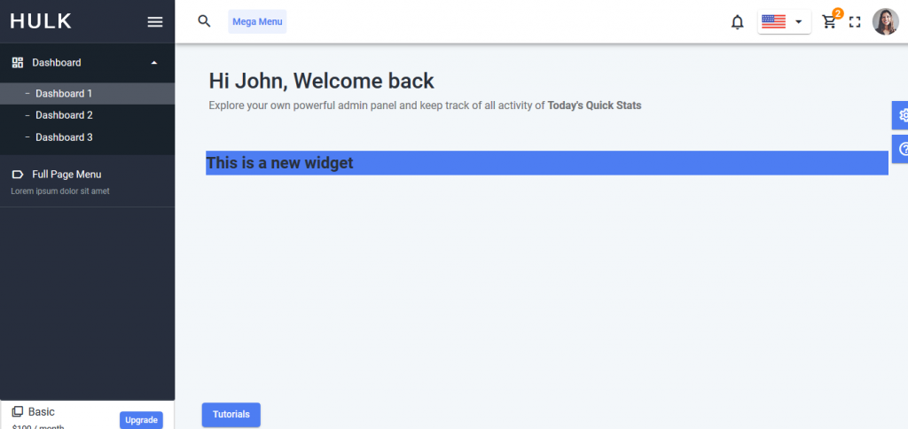
Now save the file and open the browser, you will see your newly added widget on your dashboard like below screenshot:
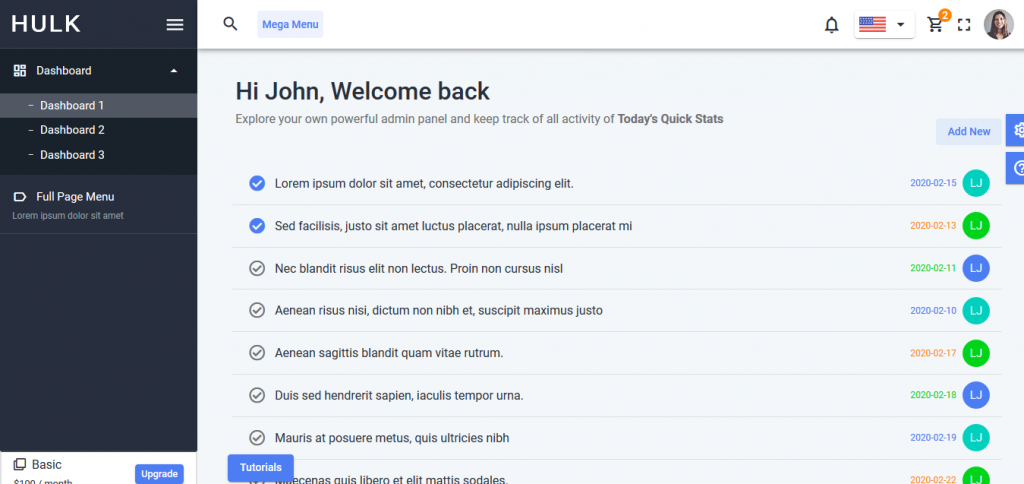
Adding an existing widget
Please follow the given steps to add an existing widget in the template. We are taking an example of adding a “Task List” on the “Dashboard1” but you can add any widget on any of the dashboard in the template:
Step 1: Opensrc->routes->dashboard->dashboard1->index.js file and add the TaskList in the papersection <Paper className={classes.Paper} square> as given in the code and also import the TaskListat the top like other import statements already imported.
import React, { Component } from 'react';
 import { withStyles } from '@material-ui/styles';
 import { Paper, Box, Container, Typography } from '@material-ui/core';
 import IntlMessages from 'util/IntlMessages';
 import { withTheme } from '@material-ui/core/styles';
 import TaskList from 'components/Widgets/TaskList'
 const styles = theme => ({
     Paper: {
         padding: '0.75rem',
         backgroundColor: 'transparent',
         boxShadow: 'none',
         '&:first-child': {
             paddingTop: '24px',
         },
         '&:last-child': {
             paddingBottom: '30px',
         }
     }
 });
 class Dashboard1 extends Component {
     state = {
         ratings: [
             { value: 885, name: 'Positive (93.4%)', itemStyle: { color: this.props.theme.palette.primary.main } },
             { value: 215, name: 'Negative (6.6%)', itemStyle: { color: this.props.theme.palette.warning.main } }
         ]
     }
 UNSAFE_componentWillReceiveProps(newProps){
         let newRatings = this.state.ratings;
         for(let i = 0; i< newRatings.length; i++){
             if(i === 0){
                 newRatings[i].itemStyle.color = newProps.theme.palette.primary.main;
             } else {
                 newRatings[i].itemStyle.color = newProps.theme.palette.warning.main;
             }
         }
         this.setState({ratings : newRatings})
     }

     render(){
       const { classes } = this.props;
       return(
         <div className="webanalytics-dashboard">
            <Container maxWidth="lg">
               <Box px={2} pt={4} pb={3}>
                  <Typography variant="h3">
                     <IntlMessages id="widgets.welcome" />
                  </Typography>
                  <Typography variant="body2" color="textSecondary">
                     Explore your own powerful admin panel and keep track of all activity of <span className="hl-text"><IntlMessages id="widgets.quickStats" /> </span>
                   </Typography>
                   <Paper className={classes.Paper} square>
                      <TaskList />
                   </Paper>
               </Box>
            </Container>
         </div>
       );
    }
  )
}
export default withStyles(styles)(withTheme(Dashboard1));
It does not matters whether you are using the seed project or the complete template, the steps remains the same for both.
