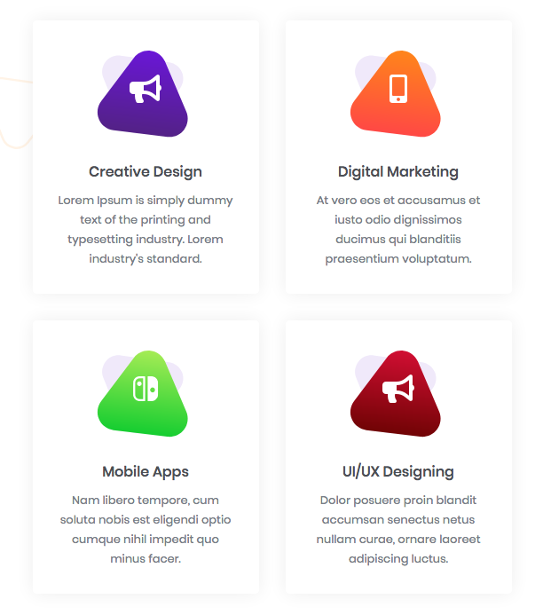
We following the concept of reusability so that with one code snippet user can use it in other sections as much as he wants. Like in the following screenshot this is the services information section and we made a widget of this section so that by changing the content user can use it easily.
Content Customization
Go to src > app > template > grid > ServiceItem and open ServiceItem.component.html . You will see the following code.
<div class="service-item card">
   <div class="icon-set">
      <div class="service-svg-1">
         <svg xmlns="http://www.w3.org/2000/svg" viewBox="0 0 122.396 126.849">
            <path class="svg-service" d="M57.148,30a20,20,0,0,1,34.641,0l29.85,51.7a20,20,0,0,1-17.321,30h-59.7A20,20,0,0,1,27.3,81.7Z" transform="translate(94.358 -30.29) rotate(68)"/>
         </svg>
      </div>
      <div class="service-svg-2">
         <svg xmlns="http://www.w3.org/2000/svg" xmlns:xlink="http://www.w3.org/1999/xlink" viewBox="0 0 110.192 103.176">
            <path data-name="Polygon Copy" attr.class="{{serviceItem.polygon_color}}" d="M57.148,30a20,20,0,0,1,34.641,0l29.85,51.7a20,20,0,0,1-17.321,30h-59.7A20,20,0,0,1,27.3,81.7Z" transform="translate(-10.791 -22.848) rotate(7)"/>
         </svg>
      </div>
      <div class="icon-wrap">
         <i class="{{serviceItem.icon}} text-white"></i>
      </div>
   </div>
   <div class="sec-title">
      <h6>{{serviceItem.title}}</h6>
   </div>
   <div class="sec-content">
      <p class="mb-0">{{serviceItem.content}}</p>
   </div>
</div>
<!-- service-item wrap close -->
Content is coming from the JSON file. Go to src > assets > data > service.json. In this file, you will find the content of the above-mentioned widget. Change the content as per your requirements.
{
    "serviceGrid" : [
        {
            "icon" : "fas fa-bullhorn",
            "title" : "Creative Design",
            "polygon_color" : "svg-primary",
            "content" : "Lorem Ipsum is simply dummy text of the      printing and typesetting industry. Lorem industry's standard."
        },
        {
            "icon" : "fas fa-mobile-alt",
            "title" : "Digital Marketing",
            "polygon_color" : "svg-secondary",
            "content" : "At vero eos et accusamus et iusto odio dignissimos ducimus qui blanditiis praesentium voluptatum."
        },
        {
            "icon" : "fab fa-nintendo-switch",
            "title" : "Mobile Apps",
            "polygon_color" : "svg-success",
            "content" : "Nam libero tempore, cum soluta nobis est eligendi optio cumque nihil impedit quo minus facer."
        },
        {
            "icon" : "fas fa-bullhorn",
            "title" : "UI/UX Designing",
            "polygon_color" : "svg-error",
            "content" : "Dolor posuere proin blandit accumsan senectus netus nullam curae, ornare laoreet adipiscing luctus."
        },
        {
            "icon" : "fas fa-mobile-alt",
            "title" : "Web Development",
            "polygon_color" : "svg-primary",
            "content" : "Lorem Ipsum is simply dummy text of the printing and typesetting industry.Lorem standard dummy"
        },
        {
            "icon" : "fab fa-nintendo-switch",
            "title" : "Digital Marketing",
            "polygon_color" : "svg-secondary",
            "content" : "Lorem Ipsum is simply dummy text of the printing and typesetting industry.Lorem standard dummy"
        }
    ],
    "serviceSlider" : [
        {
            "backgroundImage" : "assets/images/blog5.jpg",
            "backgroundText" : "U",
            "title" : "User Experience",
            "content" : "Lorem ipsum dolor sit amet, consecte tuer adipiscingelit, sed diai nonupmy nibhie euism tincidunt ut laoreet."
        },
        {
            "backgroundImage" : "assets/images/blog5.jpg",
            "backgroundText" : "B",
            "title" : "Design Websites",
            "content" : "Lorem ipsum dolor sit amet, consecte tuer adipiscingelit, sed diai nonupmy nibhie euism tincidunt ut laoreet."
        },
        {
            "backgroundImage" : "assets/images/blog5.jpg",
            "backgroundText" : "D",
            "title" : "Brand Designing",
            "content" : "Lorem ipsum dolor sit amet, consecte tuer adipiscingelit, sed diai nonupmy nibhie euism tincidunt ut laoreet."
        },
        {
            "backgroundImage" : "assets/images/blog5.jpg",
            "backgroundText" : "N",
            "title" : "Seo Optimization",
            "content" : "Lorem ipsum dolor sit amet, consecte tuer adipiscingelit, sed diai nonupmy nibhie euism tincidunt ut laoreet."
        },
        {
            "backgroundImage" : "assets/images/blog5.jpg",
            "backgroundText" : "P",
            "title" : "Creative Design",
            "content" : "Lorem ipsum dolor sit amet, consecte tuer adipiscingelit, sed diai nonupmy nibhie euism tincidunt ut laoreet."
        }
    ],
    "serviceFeatures" : [
        "Purpose, Vision & Values",
        "Responsive Websites",
        "Brand Strategy",
        "Custom Apps",
        "Logos & Visual Identies",
        "Intranets",
        "Naming",
        "Donation Tools",
        "Web Designing",
        "Seo Optimization",
        "Copywriting",
        "UX & Content Strateg"
    ]
}
All widget/section content will change as the above-mentioned steps.
Use existing section in other pages
If you want to use sections any widget in any other pages then do the following:
Let us assume that you want the following section in the About Us page
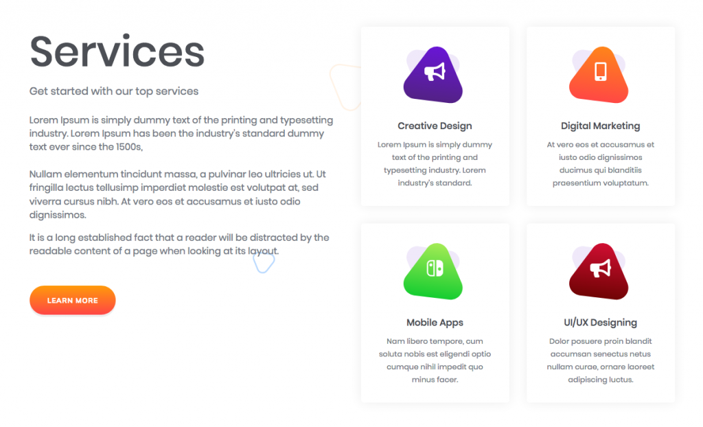
Follow the steps below:
Step:1 Go to src > app > Pages > Home and open Home.component.html file and copy service section code(HTML) as you see in the following:
   <div class="services-wrap services-wrap-v1 shape-wrap section-spacer">
      <div class="shape-group shape-group-hide">
         <span class="custom-shape pos-size-4">
            <svg xmlns="http://www.w3.org/2000/svg" xmlns:xlink="http://www.w3.org/1999/xlink" viewBox="0 0 597.014 600.045">
               <path data-name="Custom Polygon 1" class="svg-primary" d="M254.933,105c26.943-46.667,94.3-46.667,121.244,0L528.211,368.332c26.943,46.667-6.736,105-60.622,105H163.52c-53.886,0-87.565-58.333-60.622-105Z" transform="translate(289.247 -116.26) rotate(48)"/>
            </svg>
         </span>
         <span class="custom-shape pos-size-2">
            <svg xmlns="http://www.w3.org/2000/svg" viewBox="0 0 58.413 60.176">
               <path data-name="Custom Polygon 2" class="svg-border svg-border-1" d="M25.109,16.5a11,11,0,0,1,19.053,0L55.1,35.452a11,11,0,0,1-9.526,16.5H23.693a11,11,0,0,1-9.526-16.5Z" transform="translate(45.416 -13.816) rotate(68)"/>
            </svg>
         </span>
         <span class="custom-shape pos-size-3">
            <svg xmlns="http://www.w3.org/2000/svg" viewBox="0 0 118.742 111.528">
               <path data-name="Custom Polygon 3" class="svg-border svg-border-2" d="M57.148,30a20,20,0,0,1,34.641,0l29.85,51.7a20,20,0,0,1-17.321,30h-59.7A20,20,0,0,1,27.3,81.7Z" transform="translate(123.95 131.338) rotate(-172)"/>
            </svg>
         </span>
         <span class="custom-shape pos-size-1">
            <svg xmlns="http://www.w3.org/2000/svg" viewBox="0 0 482.073 504.275">
               <path xmlns="http://www.w3.org/2000/svg" data-name="Custom Polygon 4" class="svg-gray" d="M229.2,75c19.245-33.333,67.358-33.333,86.6,0L465.195,333.753c19.245,33.333-4.811,75-43.3,75H123.111c-38.49,0-62.546-41.667-43.3-75Z" transform="translate(351.63 -86.448) rotate(68)"/>
            </svg>
         </span>
      </div>
      <!-- shape group close -->
      <div class="container">
         <div class="services-content-wrap" *ngIf="serviceItems">
            <app-service-grid [serviceItems]="serviceItems.serviceGrid"></app-service-grid>
         </div>
      </div>
      <!-- service content wrap -->
   </div>
Step:2 Now go to src > app > Pages > AboutUs > About and open About.component.html. Paste this in where you require.
Step:3 Go to src > app > Pages > Home and open Home.component.ts file and search for ngOnInit() function copy service content which is following.
//service content
     this.service.getServiceContent().
         subscribe( response => {this.serviceItems = response },
                err      => console.log(err),
                ()       => this.serviceItems
            );
Step:4 Now go to src > app > Pages > AboutUs > About open its .ts file named, About.component.ts file and search for ngOnInit() function and paste the code into function like this.
ngOnInit() {
     //service content
      this.service.getServiceContent().
         subscribe( response => {this.serviceItems = response },
             err => console.log(err),
               ()=> this.serviceItems
          );

 -----
 -----
 }
Save the file and you will see the service section on About Us page.
