Changing the Font Family
We are using Google Fonts in the template as it is free to use and is easily available. For more info, please visit:
Google Fonts
Making the web more beautiful, fast, and open through great typography
fonts.google.comStep 1: To change the font family in the template, please visit the above link and select the font you wish to apply to your template and copy the embed code & font family. Example:
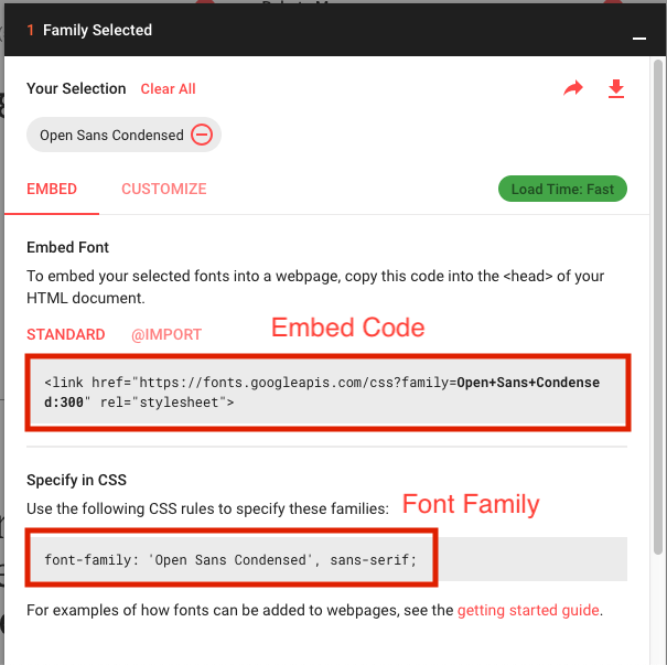
Paste the embed code in index.html file under the public folder.
Make sure to copy the embed code in the head tag of the index.html file.
Step 2: Now go to the src->assets->scss and open the _bootstrap-override.scss file and paste the font family in the variable $font-family-sans-serif like:
// stylelint-disable value-keyword-case
$font-family-sans-serif:      'Open Sans Condensed', sans-serif !default;
Changing Default Variables
Open _bootstrap-override.scss file under assets/scss folder and change style variable values as per your requirement.
Change Theme Colors
// Start with assigning color names to specific hex values.
$blue:    #5D92F4 !default;
$indigo:  #6610f2 !default;
$purple:  #2B314A !default;
$pink:    #e83e8c !default;
$red:     #FF3739 !default;
$orange:  #fd7e14 !default;
$yellow:  #FFB70F !default;
$green:   #00D014 !default;
$teal:    #20c997 !default;
$cyan:    #00D0BD !default;
Change Text Colors
$white:     #fff    !default;
$gray-100:  #ECEDEF !default;
$gray-200:  #EAEAEA !default;
$gray-300:  #C6C9CF !default;
$gray-400:  #AAAEB3 !default;
$gray-500:  #727891 !default;
$gray-600:  #474B4F !default;
$gray-700:  #878787 !default;
$gray-800:  #212224 !default;
$gray-900:  #14171A !default;
$black:     #000    !default;
Manage Spacing
// Spacing
$spacers: map-merge(
  (
    0:  0,
    10: ($spacer * .625),
    15: ($spacer * 0.9375),
    20: ($spacer * 1.25),
    25: ($spacer * 1.563),
    30: ($spacer * 1.875),
    40: ($spacer * 2.5),
    50: ($spacer * 3.125),
    70: ($spacer * 4.375)
  ),
  $spacers
);
Manage Height And Width
// This variable affects the `.h-*` and `.w-*` classes.
$sizes: map-merge(
  (
    10: 10%,
    15: 15%,
    20: 20%,
    25: 25%,
    30: 30%,
    40: 40%,
    33: 33%,
    50: 50%,
    60: 60%,
    75: 75%,
    80: 80%,
    100: 100%,
    auto: auto
  ),
  $sizes
);
Main Container
// Settings for the  <body>  element.
$body-bg:                   #f4f7fa !default;
$body-color:                #464d69 !default;
$font-family-sans-serif:      'Roboto', sans-serif !default;
Heading
With help of following variables you can easily change font sizes for all the headings ( h1 to h6 ).
$h1-font-size:                2.25rem !default;      // 36px
$h2-font-size:                1.875rem !default;     // 30px
$h3-font-size:                1.5rem !default;       // 24px
$h4-font-size:                1.125rem !default;     // 20px
$h5-font-size:                1rem !default;         // 16px
$h6-font-size:                0.875rem !default;     // 14px
Changing Custom Variables
Open _custom-var.scss file under assets/scss folder and change variable values as per your requirement.This file holds custom style variables.
Gradient Colors
If you want to use gradient color then use these variables with basic variable.
// Gradient Theme Color$light-primary: lighten($blue, 20%);$light-danger: lighten($red, 20%);$light-warning: lighten($yellow, 20%);$light-pink: lighten($pink, 20%);$light-dark: lighten($gray-900, 20%);$light-success: lighten($green, 20%);$light-info: lighten($cyan, 20%);
Sidebar Customization
By changing following variable values you can customize the sidebar.
// Sidebar Variable
$sidebar-bg:                               #2e3344;
$sidebar-width:                            16.25rem;
$sidebar-spacing:                          1rem 1.5rem; //16px 24px;
$sidebar-link-transform:                    capitalize;
$sidebar-link-font-size:                    0.875rem; //14px
$sidebar-link-font-color:                  rgba(255,255,255,0.8);
$sidebar-icon-font-size:                    1.25rem; //20px
$sidebar-link-active-color:                 $white;
$sidebar-hover-bg:                          #F3F3F3;
$sidebar-hover-color:                       $danger;
$sidebar-submenu-font-color:                $gray-900;
$sidebar-submenu-font-size:                 0.875rem; // 14px
$sidebar-submenu-bg:                        #F3F3F3;
$sidebar-submenu-spacing:                   0.625rem 0.625rem 0.625rem 4.5rem;
$sidebar-box-shadow:                        0 1px 18px 0 rgba(0,0,0,0.15);
Customize main block
// Block Setting
$block-bg:                                $white;
$block-border-radius:                     5px;
$block-margin:                            1.875rem; //30px;
$block-space:                             1.25rem; //20px;
$block-box-shadow:                        0 3px 10px 0 #DFDFDF;
$block-hover-box-shadow:                  0 13px 20px 0 #C9C9C9;
$block-transition:                        all 0.4s ease-in-out 0s;

// Block Title
$block-title-font-color:                  #878787;
$block-title-font-size:                   1.125rem; //18px
$block-title-space:                       0.75rem 1.25rem;//12px 24px;
$block-title-border-color:                $border-color;

// Block Contextual
$block-contextual-link-color:             #a5a7b2;
$block-contextual-link-size:              1.25rem; //20px
Change Header Styling
// Header variable
$header-bg:                                $white;
$header-box-shadow:                        0 4px 15px 0 rgba(0,0,0,0.09);
$header-shadow:                            0 1px 15px 1px rgba(69, 65, 78, 0.08);
$header-icon-color:                        #797F87;
$header-icon-size:                         1.5rem; //24px;
$header-height:                            4.375rem; //70px;
$header-hover-icon:                        $primary;
Pre-loader
// Loader Variable
$loader-cubeSize:                           4em;
$loader-light-bg:                          #17C7DF;
$loader-dark-bg:                           rgba(0,0,0,0.9);
Chat Variable
// Chat Variables
$chat-bg:                                 $white;
$chat-spacing:                            1.875rem; //30px;

$chat-block-bg:                           #dfeaff;
$chat-block-spacing:                      0.625rem; // 10px;
$chat-block-boxshadow:                    0 1px 2px 0 rgba(0,0,0,0.2), 0 1px 3px 0 rgba(0,0,0,0.1);
$chat-block-radius:                       3px;
$chat-block-font-color:                   $base;

$chat-item-padding:                       1rem;
$chat-item-border:                        1px solid $border-color;
$chat-item-bg-color:                      #fff;
Dark Theme
// Dark theme
$dark-bg:                                 #424242;
$dark-bg-color:                           #fff;
$dark-bg-container:                       #303030;
$dark-border-color:                       #6d6d6d;
